Thursday, March 10, 2011
Welcome to the Jungle
(Above) Jungle Doctor's Case Book by Paul White (1967)
The clear and quirky design & illustration of this cover first attracted me. I expected the contents to be quaint tales of medical missions, which they are. The heavy handed preaching that sets in and clobbers the life out of the stories is tedious however. So, enjoy the cover.
(Above) Flame of the Amazon by Eric Leyland (1952)
"What he calls fun other people call DANGER"
The inside flap of the dust jacket also proclaims:
"The boy who doesn't know David FLAME is like the boy who doesn't know 'BIGGLES'"
...which is probably true.
(Above) Tarzan and The Jewels of Opar by Edgar Rice Burroughs (1918)
Surely, Tarzan's dust jacket artwork and design (above) is unlikely to have been concurrent with the printing of the book itself, in this case 1918. The typeface and amount of bare skin seems anachronistic, wouldn't you say?
The story itself is now culturally bizarre. Tarzan gratuitously kills 3 lions within the first half of the book and other animals are lucky to escape him. Our attitudes towards nature have evolved. The author's continual and breathless adulation of this man-lord-beast-savage - "a majestic man, a noble beast" - is also a strange testament to ideas of machismo.
But I like the covers. Enjoy!
Wednesday, February 9, 2011
Vintage Postcards
Vintage Postcard, Picadilly Circus, London (circa 1950's)
(Reverse of above)
Dear Mabel... in Northern Rhodesia.
Notice the social artifact in how Mabel Pringle is addressed as Mrs C. Pringle, likely the initial and surname of her husband.
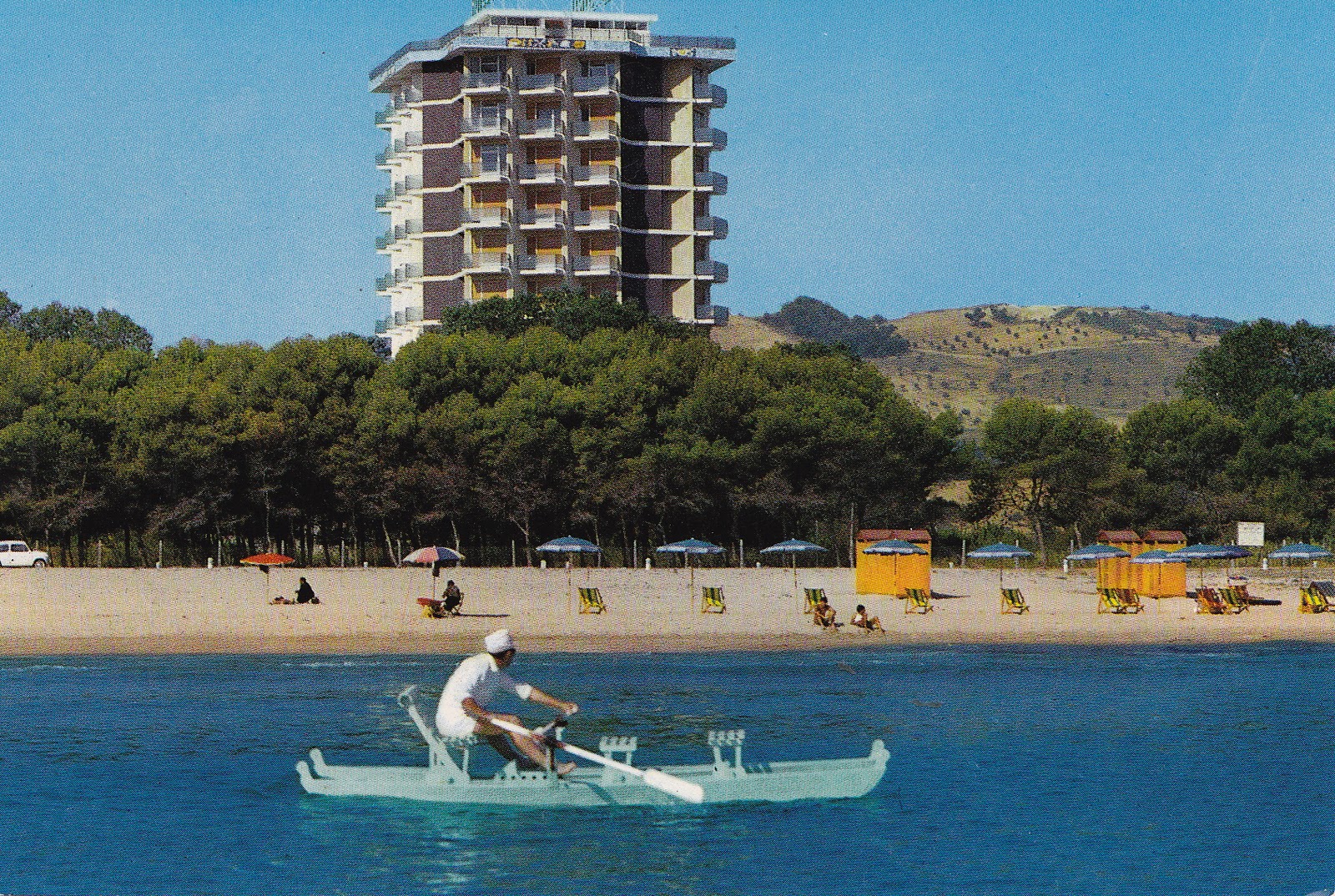
Vintage Postcard, Montesilvano, Pescara (Italia)
I enjoy the punchy colour in these vintage postcards. More to come.
(Reverse of above)
Dear Mabel... in Northern Rhodesia.
Notice the social artifact in how Mabel Pringle is addressed as Mrs C. Pringle, likely the initial and surname of her husband.
Vintage Postcard, Montesilvano, Pescara (Italia)
I enjoy the punchy colour in these vintage postcards. More to come.
Labels:
50's,
60's,
advertising,
architecture,
photography,
postcards,
vehicles,
vintage
Monday, January 10, 2011
Happy Holidays!
Well, you may still be on holiday :-). Some lucky sausages still are. I hope you had a good opportunity to change channels in your mind and refresh the parts you otherwise forget.
I enjoyed deep relaxation at a little village on a river by the sea in the Eastern Cape. Our family has gone there for decades and though some parts have changed, others haven't. One side of the river ~ from the rivermouth upstream into the distance as far as you can see ~ has remained covered by indigenous bush for the last 40 years that we've known the place. Just 3 houses dot one hillside. Its so beautiful and peaceful as a result. You don't feel crowded. You don't feel the pressure of relentless development. Instead you can appreciate the value of something that endures and which is therefore, in a sense, timeless.
Above: Tidal marsh, Kariega River, Eastern Cape - South Africa
While on holiday, I found loads of cool bits 'n bobs (vintage circus posters, postcards, 50's novels etc) that make me bollemakiesie, so lots to share over the next few weeks.
To start, enjoy these hip and happening vacation destinations.
Above: 70's postcard for the Ermelo Holiday Inn
(click image to enlarge)
This is a quirky little artifact.
Remember when everything was in two languages? Check out the pool scene. Patterned mens swimsuits. Diving board. Flared jeans. Upper right, relaxing at the bar, she's in a full length floral chiffon ensemble. Neck scarves knotted to the side. Shirts open halfway down the chest. And you just know its polyester.
Upper left, the dining room, its all about hair... and lapels.
Bottom right, notice her red 'n white little striped dress, probably terry cloth. The chunky lamp base. And of course the patterned maxi spread out on the teal and gold bedspread (take a closer look). He wears a slimfit T. Looks like a radio is built into the nightstand. Ermelo really had it all.
Anything else? Maybe just... everybody's white.
Above: 70's postcard ~ Stokkiesdraai-Spa-Motel, Nylstroom
This pool scene kicks Ermelo's butt. Aah, the sexy 70's... sipping Fanta as you relax by the pool in your yellow bikini under sunny skies. A beefy guy in tight white cozzie perusing the tanned bodies and bums laid out in front of him. Kids in the background locked up in some kind of pen.
And at lower left, white-painted rocks, genius.
I enjoyed deep relaxation at a little village on a river by the sea in the Eastern Cape. Our family has gone there for decades and though some parts have changed, others haven't. One side of the river ~ from the rivermouth upstream into the distance as far as you can see ~ has remained covered by indigenous bush for the last 40 years that we've known the place. Just 3 houses dot one hillside. Its so beautiful and peaceful as a result. You don't feel crowded. You don't feel the pressure of relentless development. Instead you can appreciate the value of something that endures and which is therefore, in a sense, timeless.
Above: Tidal marsh, Kariega River, Eastern Cape - South Africa
While on holiday, I found loads of cool bits 'n bobs (vintage circus posters, postcards, 50's novels etc) that make me bollemakiesie, so lots to share over the next few weeks.
To start, enjoy these hip and happening vacation destinations.
Above: 70's postcard for the Ermelo Holiday Inn
(click image to enlarge)
This is a quirky little artifact.
Remember when everything was in two languages? Check out the pool scene. Patterned mens swimsuits. Diving board. Flared jeans. Upper right, relaxing at the bar, she's in a full length floral chiffon ensemble. Neck scarves knotted to the side. Shirts open halfway down the chest. And you just know its polyester.
Upper left, the dining room, its all about hair... and lapels.
Bottom right, notice her red 'n white little striped dress, probably terry cloth. The chunky lamp base. And of course the patterned maxi spread out on the teal and gold bedspread (take a closer look). He wears a slimfit T. Looks like a radio is built into the nightstand. Ermelo really had it all.
Anything else? Maybe just... everybody's white.
Above: 70's postcard ~ Stokkiesdraai-Spa-Motel, Nylstroom
This pool scene kicks Ermelo's butt. Aah, the sexy 70's... sipping Fanta as you relax by the pool in your yellow bikini under sunny skies. A beefy guy in tight white cozzie perusing the tanned bodies and bums laid out in front of him. Kids in the background locked up in some kind of pen.
And at lower left, white-painted rocks, genius.
Labels:
70's,
fashion,
interiors,
photography,
postcards,
South Africa,
South African,
style,
vintage
Thursday, December 23, 2010
Victorian Theatre Programme
![]() |
| (Above) A Victorian theatre programme (cover) for 'Sweet Nancy' at the Royalty Theatre "every evening at 9 o'clock punctually", gate-folded DL printed on card. (click image to enlarge) |
![]() |
| (Above) Inside Spread (click image to enlarge) |
![]() |
| (Above) Detail: El-Ancor dinner claret advertisement |
Labels:
advertising,
design,
typography,
Victorian,
vintage,
writing
Monday, December 13, 2010
Aah, symmetry.
Rhythm.
Pattern.
Geometry.
More space than matter...
Some objects elegantly access the essence of what we call beautiful.
Saturday, December 11, 2010
Voortrekker Kitsch
Found in my archives, I originally spotted this item at a local market. The border, main lettering and outlines are a glittery silver - like crushed tinfoil just below the glass. It may well be a glass painting actually, created by painting in reverse directly on the back of the glass.The building featured is the Voortrekker Monument, a solid (and stolid) symbol of the Great Trek undertaken by early white 'Afrikaner' settlers. The flags are those of the early Afrikaner republics. The wording "Op die pad van SA ~ die bou van 'n nasie" means "On the road of South Africa ~ the building of a nation".
For non-South Africans, this is culturally like Confederate imagery. I have a few pieces of Trek kitsch in my home and was tempted to buy this one because its so distinct, exemplary in a way. Laden with nationalist symbols, its cultural and visual weight seemed just too heavy though. I guess that's cultural baggage.
Even without any explanation of language, culture, origins, I believe you would have a clear sense of the kind of message this imagery conveys. Flags, a monument, flaming torches. This is what nationalism thrives on, be it Soviet, American, Chinese or South African.
Labels:
kitsch,
South Africa,
South African,
vintage,
Voortrekker
Saturday, November 13, 2010
Ratatouille End Titles - Retro Design (Ratro design?)
Pixar pays homage to illustration of another era with this retro end credit sequence.
Tuesday, November 9, 2010
Early 60's Record Cover Designs

above: Los 3 De Santa Cruz, Piel Canela (circa 1960)
Above: (45') The Di Mara Sisters - Cha Cha!! Mambo!! Samba!!This sleeve design is so basic you can practically feel the designer cutting out the photo and crumpling paper for the background effect... which is probably exactly what he/she did.
Above: (45') O Simeli - Saint Jean de Luz (circa 1960)These 3 record sleeves are examples of design for 2 & 3 colour printing, which was a cheaper printing solution till very recently.
I haven't heard O Simeli yet to discern any reason for the naive illustration style. Is it sung by children, for example? Or perhaps the artist felt it expressed the simple joy of nature.
The O Simeli cover shows the deliberate use of off-register colour, which became distinctive of much mid-century graphic design, though in this example also naively handled.
Is this an early example of a style not yet clearly defined? (I think so.)
Or rather a loose approximation of something already being done with more assertive style elsewhere? I'm curious to know and the style deserves more and clearer examples so I'll be sure to find and post some.
Off-register colour is a technique I remember fondly since I was a kid (early 1970's), synonymous with cartoons at the drive-in, the Flintstones and Pink Panther, stylised title and credit sequences, all accompanied by grroovy music.
Aah, the drive-in.
Labels:
60's,
album,
cover art,
graphic design,
Mid-century design
Herb Alpert Album Cover Art 1963
Esther at Stax o Wax and I disagree about the merits of this 1963 album cover art - graphic, 2D and striking while surprisingly whimsical with its procession of little figures, I love it.
Japanese License Plates


Curious to know the era of these license plates, I'd love to hear if you have a clue. Each plate is 15cm long (about 6 inches). They'd look right at home in anything by Studio Ghibli.
Thursday, October 28, 2010
Old's Cool
Staying with things vehicular, this Chevrolet Apache is still hauling loads in style in Cape Town and beyond.
And following on behind (forgive the pun), this cute caravan, glimpsed in the Tankwa Karoo. I use the word 'cute' in an entirely positive sense. I can easily imagine the owners having great affection for their holiday on wheels. The only thing its lacking is an old Mercedes to lead the way.
Wednesday, October 20, 2010
Toyota MasterAce Surf
This 1987 four wheel drive (yes, you heard right, 4WD) was first driven in Nagano, Japan before making its way to Dar es Salaam, Tanzania by way of Dubai. From Tanzania it drove through Zambia, Zimbabwe and Namibia to reach its possibly final home, South Africa. When it arrived, it was still wearing snow-tyres from Nagano.
Affectionately known as Deepak, in honour of its previous Tanzanian owner, this vehicle features 6 skylights (4 that open) and revolving, foldable interior seats for multiple configurations of lounging, chilling, chatting, touring or sleeping under the stars. What a gem!
The orange and brown side decals are classic and interestingly, the letters 4WD have been designed to mimic the silhouette of the vehicle itself ~ class.
(This is clearer from the opposite side of the vehicle but if you look closer you'll get the idea :-)
Saturday, October 9, 2010
And now back to our regular broadcast...
(Gosh, I thought it'd been about 3 weeks since my last post on Bollemakiesie and see its more like 6, so this post is for me to get back in the saddle, instead of under it.)
Along the way, both on this blog and off, the question comes to me: what is Bollemakiesie?
For anyone curious, it literally means something like 'somersault' or 'head over heels'. It suggests joy and exuberance. Most days and certainly every week, I see something around me in Cape Town or from the world at large that makes me go wow, I'm glad that exists, I'm grateful to see that.
Some of the blogs I love contain slews of beautiful images and few to no words. And yet not all the things I respond to and am delighted about exist as images. So I expect there will be more words on Bollemakiesie from time to time. And down the line, I hope more music and sound too.
A picture may be worth a thousand words but for music there are no words.
Bollemakiesie is a uniquely South African expression as far as I know, though likely has a Dutch root. In response to being daunted by the scope and quality of the blogs I enjoy, I wonder: what can I share with you that will be worthwhile and make you want to 'bollemakiesie' too? I suspect it'll reflect more South African and African character. But not exlusively. There's too much wonderful stuff in the world to shut any out on account of its origin.
And beyond that, as this is an exploration, it will reflect a unique set of curiosities and interests. Perhaps they overlap here and there, or a lot, with your own.
Embedded in my psyche, from somewhere, is an appreciation of the charm and worth of old things. Not just for being old. But for being beautifully designed, and made to last. Or hilariously specific to their time, now vivid as oddities and reminders of change. Some beauty is simple, some intricate. Some is decayed and other fresh.
Great new design and art doesn't spring fully formed out of nowhere. No matter how radical, it is shaped and informed by what came before. Or by the inherent nature of things, which goes deep and way back. In a way then, the key is to see the timeless.
Recently, at a little bookseller on St George's Mall I found a slim navy blue book ~ Stray Birds by Rabindranath Tagore ~ printed in 1933, first published in 1917. The cover is used, almost burnished, but undamaged, lettered in gold. It has presence. One edge of all the pages is rough, the pages themselves textured with wide spaced phrases of timeless poetry . This chair, this table, this book, this tree, they are not done. They become more rare by continuing to exist as things disappear.
Very often what is 'new' is being sold or promoted to us. The flipside of this is apparent at any good flea market or second-hand store where amazing things go cheap. Living only in the new can result in everyone looking very similar and living in catalogue home interiors - the peril of the popular. Stretching the scope of your appreciation back a few years or decades expands the kaleidoscope for expressing your individuality. There is mystique in old things that suggests a different movie. Its fun.
I live in an old house, standing here more than a century. The walls are thick and my study window is set back under a porch. I seldom to never need to heat or artificially cool the space. Sun shines in during winter. And in summer, the interior is in deep shade. So when I look to build a house, I will learn from this one.
I'm excited and exhilarated by new architecture and technology but one of the 'greenest' easiest actions I take is to buy less new stuff. Ironically, much that is old is as under-appreciated as it is irreplaceable. My floors are wide planks of honey golden oregon pine.
Along the way, both on this blog and off, the question comes to me: what is Bollemakiesie?
For anyone curious, it literally means something like 'somersault' or 'head over heels'. It suggests joy and exuberance. Most days and certainly every week, I see something around me in Cape Town or from the world at large that makes me go wow, I'm glad that exists, I'm grateful to see that.
Some of the blogs I love contain slews of beautiful images and few to no words. And yet not all the things I respond to and am delighted about exist as images. So I expect there will be more words on Bollemakiesie from time to time. And down the line, I hope more music and sound too.
A picture may be worth a thousand words but for music there are no words.
Bollemakiesie is a uniquely South African expression as far as I know, though likely has a Dutch root. In response to being daunted by the scope and quality of the blogs I enjoy, I wonder: what can I share with you that will be worthwhile and make you want to 'bollemakiesie' too? I suspect it'll reflect more South African and African character. But not exlusively. There's too much wonderful stuff in the world to shut any out on account of its origin.
And beyond that, as this is an exploration, it will reflect a unique set of curiosities and interests. Perhaps they overlap here and there, or a lot, with your own.
Embedded in my psyche, from somewhere, is an appreciation of the charm and worth of old things. Not just for being old. But for being beautifully designed, and made to last. Or hilariously specific to their time, now vivid as oddities and reminders of change. Some beauty is simple, some intricate. Some is decayed and other fresh.
Great new design and art doesn't spring fully formed out of nowhere. No matter how radical, it is shaped and informed by what came before. Or by the inherent nature of things, which goes deep and way back. In a way then, the key is to see the timeless.
Recently, at a little bookseller on St George's Mall I found a slim navy blue book ~ Stray Birds by Rabindranath Tagore ~ printed in 1933, first published in 1917. The cover is used, almost burnished, but undamaged, lettered in gold. It has presence. One edge of all the pages is rough, the pages themselves textured with wide spaced phrases of timeless poetry . This chair, this table, this book, this tree, they are not done. They become more rare by continuing to exist as things disappear.
Very often what is 'new' is being sold or promoted to us. The flipside of this is apparent at any good flea market or second-hand store where amazing things go cheap. Living only in the new can result in everyone looking very similar and living in catalogue home interiors - the peril of the popular. Stretching the scope of your appreciation back a few years or decades expands the kaleidoscope for expressing your individuality. There is mystique in old things that suggests a different movie. Its fun.
I live in an old house, standing here more than a century. The walls are thick and my study window is set back under a porch. I seldom to never need to heat or artificially cool the space. Sun shines in during winter. And in summer, the interior is in deep shade. So when I look to build a house, I will learn from this one.
I'm excited and exhilarated by new architecture and technology but one of the 'greenest' easiest actions I take is to buy less new stuff. Ironically, much that is old is as under-appreciated as it is irreplaceable. My floors are wide planks of honey golden oregon pine.
Thursday, August 26, 2010
South African Art - recycled materials
South African artist, Simon Max Bannister has created a series of striking artworks from plastic waste, drawing attention to plastic in the oceans . The moody beasts below are two of my favorites. Explore here for more.


Simon's work will be exhibited at the Two Oceans Aquarium Cape Town from October 2010 to January 2011. Also on the Plastic Max Artworks site are examples of Simon's lightworks, evocative of swirling kelp and underwater depths. Paradoxically, made of a substance foreign to the nature of the sea.


Simon's work will be exhibited at the Two Oceans Aquarium Cape Town from October 2010 to January 2011. Also on the Plastic Max Artworks site are examples of Simon's lightworks, evocative of swirling kelp and underwater depths. Paradoxically, made of a substance foreign to the nature of the sea.

Wednesday, August 25, 2010
Design: Nick Sherman

(above) Vintage-style flyer design by Nick Sherman (copyright). (Click image to enlarge)
Definitely have a closer look at Nick Sherman's design gallery here. He includes fascinating images of his inspiration, studies, draft designs and style references.
Labels:
flyer,
graphic design,
poster,
typography,
vintage
Tuesday, August 24, 2010
Typeface - great characters, both wooden and human.
This downbeat 'trailer' (6 minutes) explores a vintage art: letterpress printing with movable wooden type. I want to see this movie. I like it already. I want to touch those big letters and see the bright ink come up on the page. Technology is useful but old school rules.
The title sequence/trailer below is also definitely worth a squizz.
Below, inspiring typographic design associated with the film, Typeface.
All proceeds from the sale of the limited edition prints featured below will go towards completion and distribution funds for Typeface.
(above) Typeface Print by David Ichiyama.
(above) Typeface Print by Dennis Ichiyama.
More by Dennis Ichiyama here.
(above) Print by Nick Sherman.
More Nick Sherman.
(above) Print by Stacey Stern.
All the above prints and others are available here.
The title sequence/trailer below is also definitely worth a squizz.
Below, inspiring typographic design associated with the film, Typeface.
All proceeds from the sale of the limited edition prints featured below will go towards completion and distribution funds for Typeface.
(above) Typeface Print by David Ichiyama.
(above) Typeface Print by Dennis Ichiyama.More by Dennis Ichiyama here.
(above) Print by Nick Sherman.More Nick Sherman.
(above) Print by Stacey Stern.All the above prints and others are available here.
Thursday, August 19, 2010
Radio Gaga
(above) DeWALD American Art Deco Radio, circa 1938. More here.I couldn't resist sharing this amazing looking radio from Ric and Iza Emmett at Modernism Gallery.
1930's Wallpaper Design
(Above) A French Art Deco colour woodcut of a wallpaper design from the 1930’s by Raoul Dufy (1877-1953), depicting 'sailors with their ladies amid exotic foliage'. Click image for a closer look and here for more.
(Above) 1930's French Art Deco colour woodcut of a wallpaper design by Jules Leleu (1883-1961). Click image to enlarge or here for more 1930's deco at Modernism Gallery.
Labels:
30's,
Art Deco,
design,
graphic design,
wallpaper
1930's Poster Design
(Above) 1936-38 "Keep Your Teeth Clean" The WPA (Works Progress Administration) published this poster between 1936 and 1938 as part of a public health program to promote oral hygiene.
See more and available here.
(Above) 1936-38 "See America" Designed by Jerome Roth in 1937 for the United States Travel Bureau, promoting travel to Montana. See more here.
Wednesday, August 18, 2010
Lovers' Luau - Les Paul and Mary Ford (1959)

Despite a patch of damage, there's plenty I love about this record cover: its amber hue, lurid splashes of colour, great textiles & anthropological feel.
For the full luau, visit Esther at Stax o' Wax. I'm listening, swaying & smiling right now.
Subscribe to:
Posts (Atom)